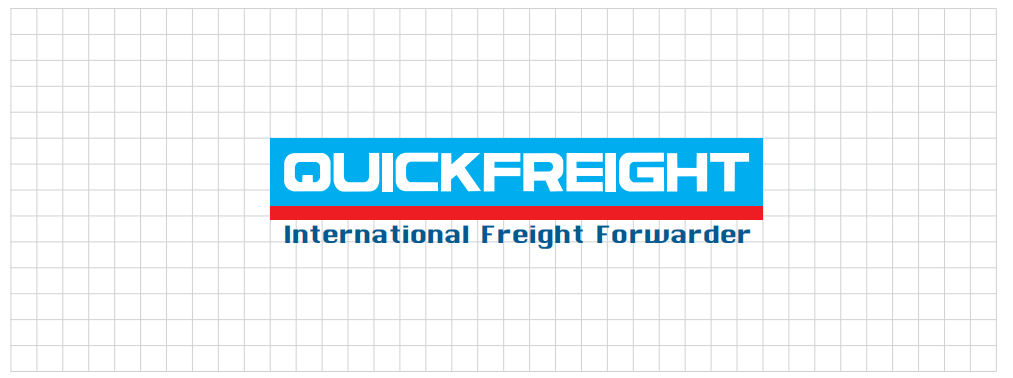
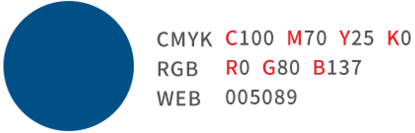
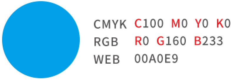
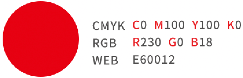
The creative art of the logo is mainly based on the name English to start the design. The English alphabet is the main structure, and the color is the auxiliary element combination. English is the icon design to highlight the industry characteristics. With sky blue as the main color, we want to reflect the industry flying in the sky, red represents the world, and navy blue reflects the integration of the three colors in the water, shaping the brand image, embodying the brand, and sublimating the visual effect.